
Luke SIGMUND Consultant
×
Color Psychology in the Workplace: Calming vs Stressful Colors for 2026
A wall color is never neutral. It can calm a room or keep it on edge. What does your office say to the nervous system?
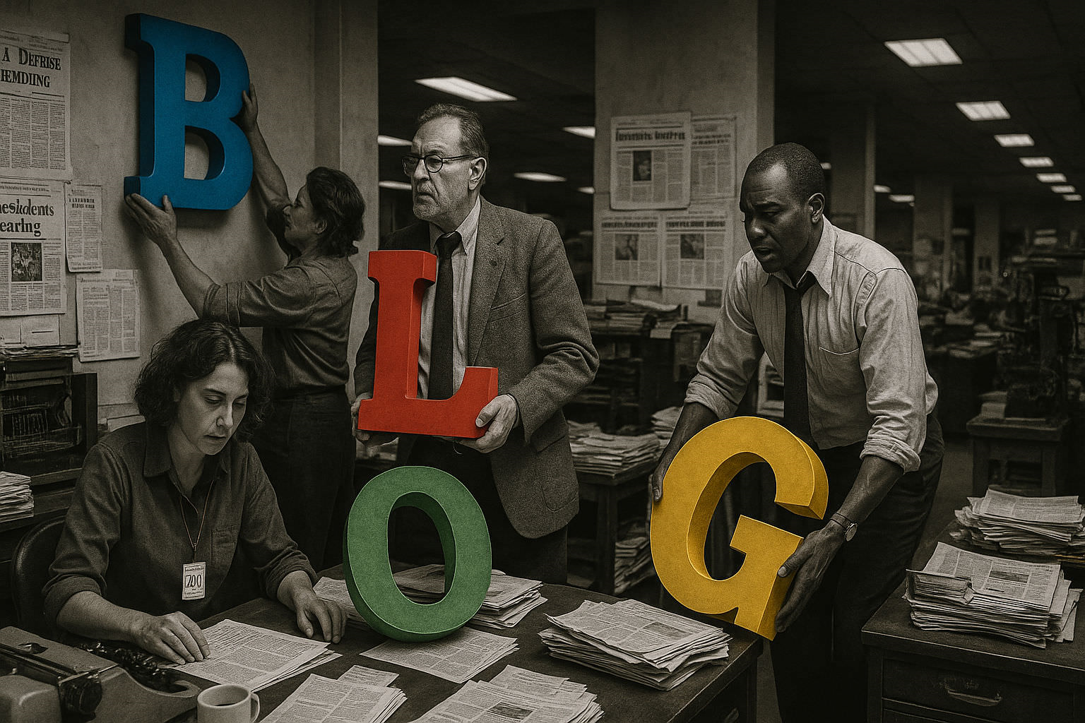
Color psychology workplace calming vs stressful colors 2026
Color changes the room before people notice it. That is why color psychology workplace calming vs stressful colors 2026 matters in offices, meeting rooms, and break spaces. A blue wall can slow the sense of pressure. A bright red wall can keep the brain alert. The point is simple. People do not enter a room as blank minds. They enter with stress, focus, and fatigue already in play.
For office color scheme productivity, the first question is not “What looks nice?” It is “What does the body feel?” Soft tones often help lower visual load. Strong tones often raise it. In daily work, that can change how fast someone settles into a task, how long they stay focused, and how tired they feel at 4 p.m. If you lead a team, do you want energy all day, or calm control?
Point cle: Calm walls do not fix a bad workload. They can reduce friction in the space where people work.
Why wall color affects stress
Color acts through perception. The eye sends signals to the brain fast. That is why wall colors employee wellbeing is not a decorative topic. It touches nervous system load, mood, and recovery. In a loud office, a harsh wall color can add one more layer of tension. In a quiet room, a soft wall color can help people settle faster. The result is not magic. It is environment design.
Researchers and workplace bodies keep linking environment and health. The UK HSE says that work-related stress, depression, or anxiety caused 17.1 million lost working days in Great Britain in 2022/23. That scale matters. When the room feels calmer, people may recover faster between meetings. When the room feels tense, small stressors stack up.
What calm looks like in practice
Think of a quiet HR interview room. Beige walls. Low glare. Soft daylight. The room helps the conversation. Now think of a canteen painted in neon orange. The room pushes energy up. That may work for a short burst. It rarely works for recovery. Calming paint colors work best when the finish is matte or low-sheen, the palette stays muted, and the room has enough light to avoid dullness.
“The best interior color is the one that lets people forget the wall and focus on the task.”
Calming paint colors work in offices and rest spaces
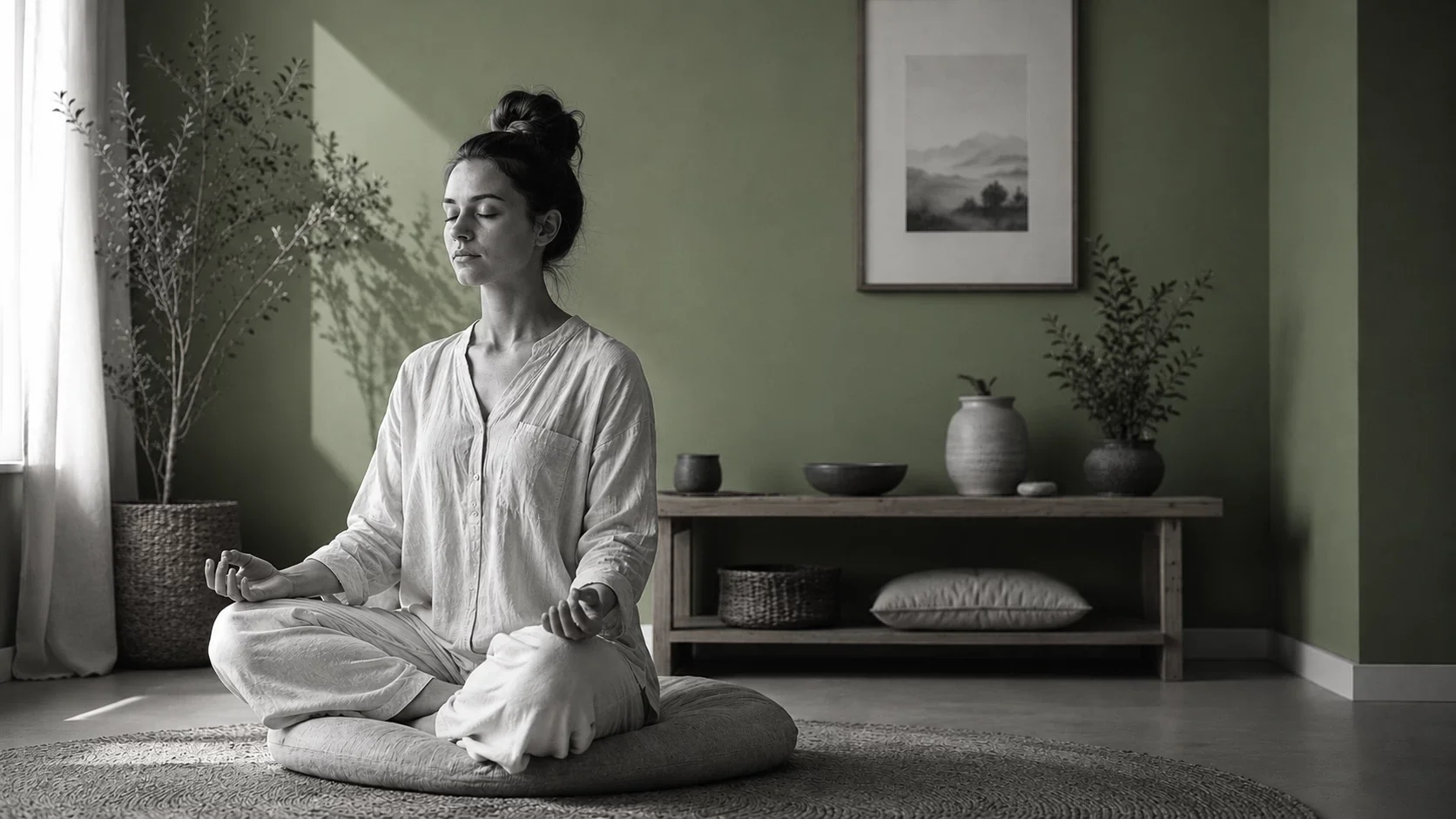
Blue, green, lavender, and warm neutrals are the most reliable calming paint colors work teams can use. They do not shout. They soften the room. Blue is often linked to slower pulse and lower perceived tension. Green feels natural and steady. Lavender adds a quiet, light emotional tone. Warm neutrals such as linen, taupe, and greige create stability without coldness. In a busy office, that can reduce visual noise.
For wall colors employee wellbeing, the key is saturation. A pale blue often feels calmer than a vivid one. A muted green often feels better than a neon one. This matters in offices with open plans, shared desks, and frequent calls. People already process constant input. The wall should not add more. If the room is for coaching, onboarding, or deep focus, calmer tones often support the task better than saturated colors.
The safest palette for daily work
- OK Use pale blue for focus rooms and quiet work zones.
- OK Use sage green for rooms that need balance and ease.
- OK Use warm beige or greige for shared spaces and reception areas.
- OK Use lavender in low-traffic rooms that need softness.
In one UK-based survey cited by Travelodge, people sleeping in blue bedrooms reported an average of 7 hours and 52 minutes of sleep per night. That does not prove every office should be blue. It does show that a cool, stable tone can support rest. In an office, that same logic can help in quiet rooms, wellness rooms, and recovery corners.
How to use calm without making the room dull
Calm does not mean flat. Pair muted walls with wood, fabric, plants, and simple art. Add light through lamps, not just overhead fixtures. Keep contrast gentle. A warm neutral wall with dark chairs can look composed. A soft green wall with natural texture can feel grounded. The room should feel human. Not clinical.
Stressful colors avoid office when the goal is focus
Some colors do more harm than good in working rooms. Stressful colors avoid office often includes intense red, bright orange, and very strong yellow. These colors can raise arousal. That is useful in short bursts. It is not useful when someone needs to read, think, or handle a tense conversation. A red wall behind a manager’s desk can feel aggressive. An orange wall in a small meeting room can feel tiring.
Color psychology workplace calming vs stressful colors 2026 is not about banning color. It is about dosage. A strong accent may work on one chair, one poster, or one niche wall. It becomes a problem when it covers the whole room. In HR settings, that can matter during interviews, coaching, conflict resolution, and return-to-work meetings. The room should lower pressure, not raise it.
When strong color backfires
Red can feel energizing in a gym. In an office, it can feel like pressure. Orange can feel social in a café. In a boardroom, it can feel noisy. Bright yellow can feel cheerful in small touches. On all four walls, it can feel exhausting. The issue is not taste. It is nervous system load.
The U.S. Whole Building Design Guide explains that interior design choices affect comfort, performance, and occupancy experience. That is useful here. If a room is used for concentrated work, choose colors that support attention. If a room is used for short social breaks, stronger accents may be acceptable in small amounts.
What to remove first
- Remove full-wall saturated red in focus rooms.
- Remove bright orange in small rooms with no natural light.
- Remove harsh yellow in spaces used for conflict talks or coaching.
- Remove glossy finishes that make strong color feel sharper.
Attention: A strong color can look harmless on a sample card. On four walls, it can feel very different after 20 minutes.
Color psychology science behind workplace wellbeing
Color psychology workplace calming vs stressful colors 2026 needs evidence, not guesswork. The science points to arousal, attention, and perceived comfort. It is not only about liking a color. It is about how the room changes the body’s state. Blue and green often reduce perceived strain. Red and orange often increase activation. That difference matters when the space is used all day.
In the workplace, design choices influence how people feel before they even start a task. The SHRM has repeatedly linked workplace wellbeing to environment, workload, and manager support. Color is only one part of that system. Still, it can either help or hurt the broader wellbeing effort. A soft palette can support recovery between tasks. A harsh palette can keep people in a state of low-grade alert.
Useful numbers to remember
- 7h52 Average sleep reported in a blue bedroom study cited by Travelodge.
- 58% Of sleepers in that study said they woke up feeling serene.
- 50% Reduction in anxiety symptoms reported in a Harvard Medical School relaxation context with blue environments.
- 17.1 million Lost working days linked to work-related stress, depression, or anxiety in Great Britain in 2022/23, according to HSE.
- 1 Good lesson: the wall is part of the work system.
Numbers help, but the room still has to be experienced. Stand in the space at 9 a.m. Then again at 3 p.m. Does the color still feel calm? Or does it start to press on the eyes? That second moment is often the real test.
SIGMUND tests for workplace design and stress resilience
When you choose colors for an office, you are also shaping the context for people’s behavior. That is where SIGMUND can help. A workplace that supports calm often needs more than paint. It needs a view of stress tolerance, engagement, and how teams respond under pressure. If you want a broader view of the human side of space, explore the stress resilience assessment.
You can also connect space choices to talent use cases. A quiet room may help onboarding. A balanced room may support feedback talks. A clear room may help coaching. If you want to read more on workplace topics, visit the SIGMUND HR resources. If your team wants a deeper read on motivation and commitment, the motivation and engagement assessment is a useful next step.
What to do before repainting
- List the room’s purpose.
- Name the stress level of the people using it.
- Decide whether the room should calm, focus, or energize.
- Test one muted sample on the wall for 48 hours.
- Observe it in daylight and artificial light.
Want a broader view of personality and team behavior before you change the room? Start with the SIGMUND personality test. Then translate the result into a calmer office color plan.
Explore SIGMUND HR assessmentsColor psychology workplace calming vs stressful colors 2026: what to use now
Start with the room people use after a hard call. Start with the break area. Start with the quiet room. That is where calming paint colors work first. Soft sage. Warm beige. Pale blue. These tones lower visual noise. They help the body leave alert mode sooner. In the Harvard Medical School source via Sleep Health, anxious people slept 25 percent better in warm soft rooms. That is not decoration. That is recovery.
Ask a simple question. What happens after lunch in your office? If energy drops, the wall color may be part of the problem. A blue wall can keep cognitive activation 30 percent higher than beige pink, which works against sleep and quiet focus. For an office color scheme productivity plan, use gentle color near rest zones. Keep stronger color away from long-stay seats. The room should help people reset, not keep them on edge.
Point cle: Use calm color where people recover. Use brighter color where people move fast. Do not reverse that logic.
Where calm colors work best
Use soft tones in phone booths, quiet rooms, and mother rooms. Use them near windows where light already does much of the work. A pale wall helps the brain settle. A warm neutral supports longer focus without fatigue. In practical terms, that means fewer restless pauses, fewer tense side talks, and better feedback moments after a hard meeting. The room lowers friction. The people do the rest.
What the numbers say
- 25 percent better sleep in warm soft rooms, according to the 2023 Harvard Medical School source via Sleep Health.
- 30 percent higher cognitive activation with strong blue walls versus beige pink in the same source.
- 40 percent lower anxiety with well chosen colors in the University of Manchester material cited by Psychology Today.
- 15 to 20 percent higher heart rate and muscle tension with intense red in the same Manchester summary.
These figures are useful because they give you a floor, not a mood. You can brief facilities teams with them. You can explain why a room feels tense before anyone says it out loud. You can build a calm palette around real behavior, not taste. For a stronger evidence base, pair this with leadership potential assessment data when the goal is team climate, not just paint.
Stressful colors avoid office: which shades raise tension
Some colors are not evil. They are simply loud. Intense red. Saturated orange. Hard yellow. These are stressful colors avoid office when the goal is calm, focus, and steady work. In the source material from Sleep Health, orange and saturated yellow increase alertness and make falling asleep harder by 20 percent. That matters in wellness rooms and even in late-day meeting spaces. A color that wakes a gym is not the right color for a recharge corner.
Think of the daily office rhythm. People arrive with a full inbox. They sit down. They scan tasks. If the walls shout at them, the room steals attention before the first KPI is even open. Strong red can lift heart rate by 15 to 20 percent, which may help in an active zone. It is a bad trade in a place built for calm, careful work. Use intense color in tiny doses. Never as the main event.
Red flags in real offices
Watch for these signs. People leave a room faster than needed. They speak in shorter sentences. They complain about glare, noise, or pressure without naming color. That is often a signal. Color is part of the setting, not the whole story. Yet it can push a tense room over the edge. If your team already runs hot, avoid big red surfaces near desks, interview rooms, or long meetings.
Where strong color can stay
Keep strong color in small accents. A chair. A frame. A notice board. A pantry wall seen for 10 seconds, not 10 hours. This keeps energy without overload. The 60-30-10 rule helps here. Use 60 percent calm base, 30 percent warm support, 10 percent vivid accent. NV Gallery cites a 35 percent drop in perceived stress in a 1,200-person survey when that balance is used well. The ratio is simple. The effect is real.
Attention : Do not use intense red as a full-room answer. It can lift tension faster than a manager can fix it.
Color psychology science: how to link paint to wellbeing
Good color choices do not start with a paint chip. They start with behavior. Where do people feel drained? Where do they need focus? Where do they need fast energy? That is the real color psychology workplace calming vs stressful colors 2026 question. The science points in one direction. Soft warmth helps recovery. Cool pale tones support low-stress focus. Loud saturation raises arousal. The room should serve the task, not the catalog.
For evidence, use the University of Manchester material summarized in Psychology Today. It links better color choice to 40 percent lower anxiety and better sleep quality. It also notes that red intensity can raise muscle tension and heart rate by 15 to 20 percent. That is useful in a wellness review because it lets HR, the CEO, and facilities speak the same language. No guesswork. No design theatre.
Build a simple test plan
- Pick one room.
- Define one problem.
- Choose one calm base color.
- Add one warm support tone.
- Keep one vivid accent only.
- Ask people how the room feels after 2 weeks.
That is enough for a first pass. You do not need a large remodel. You need a measurable change. Pair it with a short pulse survey on stress, focus, and recovery. If the room is a meeting area, compare feedback before and after the change. If the room is a quiet room, compare how long people stay there and whether they return calmer.
Use the right benchmark
Use workplace wellness as the benchmark, not style blogs. SHRM regularly frames wellbeing as part of performance. The UK HSE also treats stress as a work design issue, not a personal flaw. That matters. Color is part of the work setting. It belongs in the same review as lighting, sound, and seating. If you need a broader people lens, link the space review to motivation and engagement assessment results.
Office design application: from palette to action
This is where most teams stall. They like the idea. They skip the rollout. Do not do that. Start with one floor, one department, or one room type. Then write the color rules. Calming base in recovery spaces. Neutral warmth in long-focus spaces. Small vivid accents in social or active zones. That is how an office color scheme productivity plan becomes visible. It is also how you avoid endless taste debates.
The right sequence is simple. First, map the work pattern. Then, match the color pattern. A call center has different needs from a boardroom. A collaborative zone is not a quiet zone. A pantry is not a deep-work room. Once the function is clear, the color choice gets easier. That is the bridge SIGMUND makes that trend lists do not. It connects color psychology with workplace wellness assessment.
A practical room-by-room guide
- Quiet rooms Use pale blue, sage, or warm beige.
- Meeting rooms Use calm base tones with one light accent.
- Break areas Use warmer neutrals that feel human, not sterile.
- Active zones Use stronger accents in small doses only.
Keep the office readable. People should know what each room is for the moment they enter. That lowers decision fatigue. It also helps onboarding. New hires learn the culture faster when the space behaves in a clear way. A quiet room that looks quiet. A collaboration room that feels active. A recovery room that feels restful.
Bring in local guidance
For UK teams, the HSE wellbeing lens is useful because it treats stress prevention as part of work design. For US teams, SHRM and workplace wellness language help leaders connect environment to retention and daily function. For global teams, keep the language simple: the room should reduce strain, support focus, and help people reset. That is enough to guide paint, furniture, and layout decisions without overcomplication.
Wall colors employee wellbeing: how to prove the ROI
Do not sell color as taste. Sell it as a small operational lever. The ROI shows up in fewer complaints, better room use, better sleep after late work, and steadier mood in hard weeks. That is what wall colors employee wellbeing really means. It is not a design slogan. It is a working hypothesis you can test.
The best office color is the one that helps people do the next hour better than the last one.
Measure what matters
- Stress score Ask one short pulse question each week.
- Use rate Track whether calm rooms are actually used.
- Feedback quality Listen for fewer comments about tension or glare.
- Recovery time Ask whether people feel reset after breaks.
Use numbers from the source material as your first benchmark. 25 percent better sleep. 30 percent higher activation with strong blue. 40 percent lower anxiety with better color choice. 15 to 20 percent higher heart rate with intense red. These are not universal laws. They are strong signals. They help you move from opinion to action. That is the point.
What to do next
Pick one room this month. Replace one harsh color. Add one calmer surface. Gather feedback from the people who use the room most. Then decide whether to expand. If you want a wider people strategy, connect the space review to a personality test so managers understand how different profiles react to the same setting. Some people need quiet. Some need stimulation. Good design respects both.
Ready to transform your hiring process?
Discover SIGMUND assessment tests — objective, science-based, immediately actionable.
Discover the testsFrequently Asked Questions
Soft sage, warm beige, pale blue, and muted pink are the most calming workplace colors. They reduce visual noise and help people leave alert mode faster. Use them in break rooms, quiet rooms, and meeting spaces for the strongest stress-reducing effect.
Blue walls often feel calming because they lower the sense of pressure and make a room seem less intense. In workplace settings, blue can support focus without adding visual tension. It works best when paired with soft lighting and low-contrast furniture.
Bright red, harsh orange, and highly saturated yellow can increase stress in offices because they keep the room visually active. These colors are better used in small accents, not on large wall surfaces, especially in meeting rooms or recovery areas.
Calming paint colors lower visual stimulation, which helps employees relax after high-pressure tasks. In softer rooms, people recover faster, concentrate better, and feel less mentally overloaded. This is especially useful in break areas, quiet rooms, and spaces used after difficult calls.
Wall color can affect stress levels immediately, because people react to visual environments within seconds. The impact is strongest over time in rooms used daily. A calmer palette in a break room or meeting space can consistently support better mood and recovery.
Calming office colors have lower saturation and softer contrast, such as beige, sage, and pale blue. Stressful colors are brighter and more intense, such as vivid red or neon tones. The first reduces mental load; the second increases alertness and tension.
📚 Related articles
- →Explore the 2026 legal landscape regarding psychometric testing and data protection compliance.
- →Learn about essential HR compliance strategies for directors and legal managers in the US.
- →Discover the importance of GDPR compliance in psychometric tests for candidate assessments.
- →Read a comprehensive guide on implementing GDPR-compliant psychometric testing in HR.
Explore the SIGMUND Test Catalog
Discover our comprehensive range of scientifically validated psychometric tests
Leave a commentOrder by
Newest on top Oldest on top